
Color is a fundamental element of design that has the power to evoke emotions, set moods, and create lasting impressions. Whether you’re decorating your home, designing graphics, or choosing outfits, the right two-color combination can make a world of difference. Pairing two colors effectively is an art that requires an understanding of harmony, contrast, and balance. In this guide, we’ll explore the significance of two-color combinations and how to use them to elevate aesthetics in any setting.
Why Two-Color Combinations Matter
Two-color combinations are widely used because of their simplicity and effectiveness. They provide enough contrast to be visually striking while remaining cohesive and easy to work with. Compared to multi-color palettes, two-color combinations are less overwhelming and more focused, making them perfect for designs, décor, and branding.
Key reasons why two-color combinations are impactful:
- Simplicity: Two colors create clarity and avoid the confusion of complex palettes.
- Versatility: They can be applied across various mediums, including interiors, fashion, logos, and marketing materials.
- Memorability: Iconic designs often rely on two colors to stand out and stay etched in people’s minds.
- Emotional Resonance: Colors influence emotions and behaviors, and the right combination can enhance the intended mood.
Popular Two-Color Combinations and Their Effects
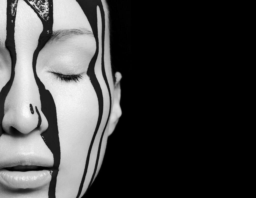
1. Black and White
The classic black-and-white combination is timeless and versatile. This high-contrast pairing represents elegance, sophistication, and simplicity. Whether used in interior design, fashion, or branding, black and white exude a minimalist yet powerful vibe.
- Where to Use: Monochrome interiors, formal attire, minimalist logos.
- Why It Works: The balance between the boldness of black and the purity of white creates a striking visual impact.
2. Blue and White
Blue and white are synonymous with calmness, freshness, and tranquility. This combination is particularly popular in coastal and nautical designs but also works well in corporate branding due to its professional appearance.
- Where to Use: Bathroom décor, office branding, casual wear.
- Why It Works: White enhances blue’s soothing properties, creating a serene and clean aesthetic.

3. Red and Black
The bold combination of red and black is dramatic and powerful. It conveys passion, energy, and authority, making it an ideal choice for luxury brands, high-impact graphics, or modern interiors.
- Where to Use: Modern living spaces, high-fashion ensembles, advertisements.
- Why It Works: The deep intensity of black contrasts with the fiery energy of red for a visually arresting effect.
4. Green and Beige
Green and beige reflect nature and warmth. This combination is ideal for creating earthy, relaxing spaces that feel grounded and organic.
- Where to Use: Living rooms, eco-friendly branding, casual outfits.
- Why It Works: Beige softens green’s vibrancy, creating a natural and harmonious feel.
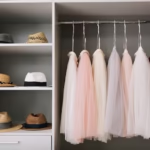
5. Pink and Gray
Pink and gray create a balance between playful and sophisticated. The soft warmth of pink contrasts beautifully with the cool neutrality of gray, resulting in a chic and modern look.
- Where to Use: Bedroom décor, feminine branding, fashion accessories.
- Why It Works: The subtle nature of gray tones down pink’s sweetness for a polished and balanced pairing.
6. Yellow and Blue
Yellow and blue are energetic and cheerful. This complementary combination is bold and bright, making it perfect for playful and lively designs.
- Where to Use: Children’s rooms, casual clothing, sports team logos.
- Why It Works: The warm vibrancy of yellow is balanced by the cool stability of blue.
7. Purple and Gold
Purple and gold are often associated with luxury, royalty, and opulence. Together, they create a rich and dramatic aesthetic that exudes sophistication.
- Where to Use: High-end branding, formal décor, festive attire.
- Why It Works: Gold enhances purple’s regal undertones, creating a sense of grandeur.
8. White and Gold
White and gold evoke elegance and purity. This combination is ideal for weddings, luxury designs, and chic interiors.
- Where to Use: Wedding invitations, premium packaging, bedroom décor.
- Why It Works: Gold adds a touch of glamour to white’s simplicity, creating a timeless and refined look.
How to Choose the Perfect Two-Color Combination
Selecting the right two-color combination requires consideration of the purpose, setting, and audience. Here are some tips to help you make the best choice:
1. Understand the Mood You Want to Create
Colors evoke specific emotions, so choose combinations that align with your desired mood:
- Calming: Blue and white, green and beige.
- Energizing: Yellow and blue, red and black.
- Elegant: Purple and gold, black and white.
2. Consider the Context
The setting or purpose of your design determines the best colors to use:
- Interior Design: Use softer combinations like pink and gray for bedrooms or green and beige for living spaces.
- Branding: Choose bold pairings like red and black or yellow and blue for logos and advertisements.
3. Leverage the Color Wheel
The color wheel can guide you in selecting complementary or contrasting colors. Opposite colors on the wheel create high contrast, while adjacent colors offer harmony.
4. Test Your Palette
Before finalizing a combination, test how the colors look together in different lighting or on different mediums (e.g., screens, paper, or fabric).
Two-Color Combinations in Different Applications
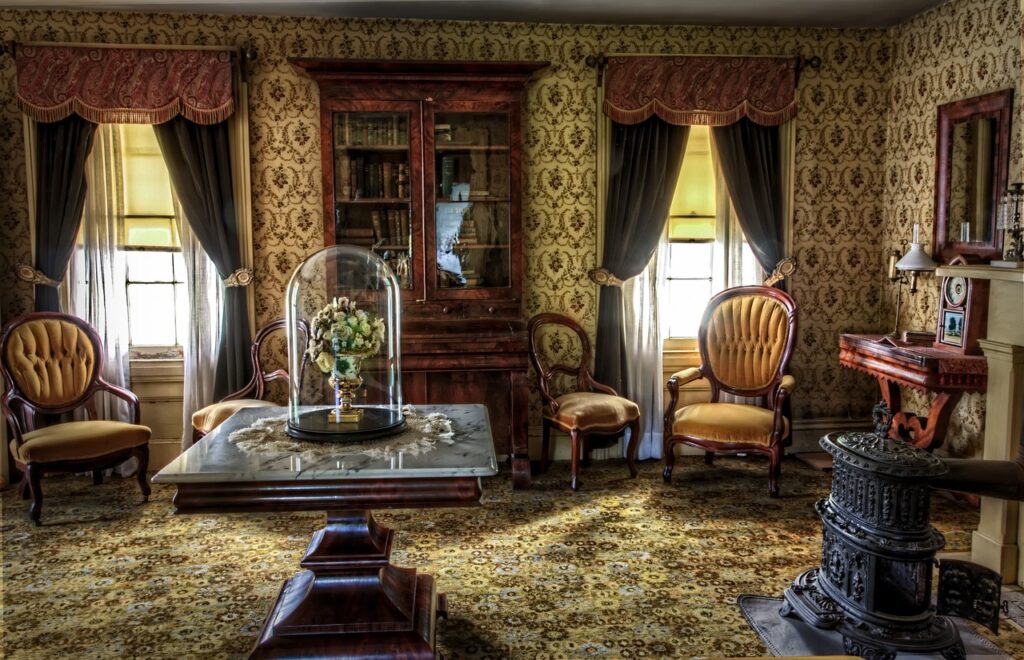
1. Interior Design
Two-color schemes can transform a room, making it feel larger, cozier, or more dynamic. For example:
- Use white and beige for a tranquil bedroom.
- Combine black and gold for a luxurious living room.
- Add pops of yellow in a predominantly gray kitchen for energy.
2. Fashion
Fashion thrives on color combinations to create stylish and eye-catching outfits:
- Pair navy blue with white for a nautical-inspired look.
- Combine red and black for bold evening wear.
- Use pastel pink and gray for soft, romantic styles.
3. Branding and Graphic Design
In branding, color combinations convey a brand’s identity and message:
- Red and yellow (like McDonald’s) create excitement and appetite.
- Blue and white (like Facebook) represent trust and reliability.
- Black and white signify timelessness and professionalism.
4. Weddings and Events
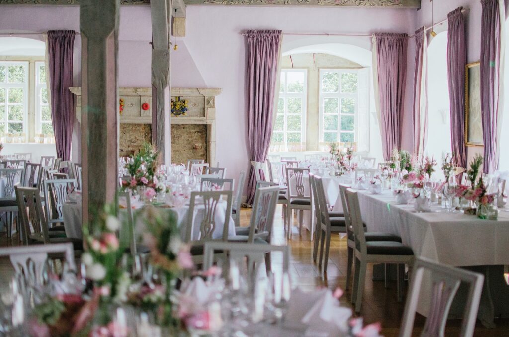
Two-color combinations set the theme and mood for events:
- White and gold are classic for weddings.
- Lavender and silver create a dreamy, romantic atmosphere.
- Navy and blush pink are perfect for elegant parties.
Mistakes to Avoid with Two-Color Combinations
While two-color combinations are straightforward, certain mistakes can detract from their effectiveness:
- Ignoring Contrast: Colors that are too similar can blend together and lack visual impact.
- Overusing Bold Colors: Pairing two intense colors can feel overwhelming. Balance one bold color with a neutral tone.
- Neglecting the Context: Bright, playful combinations might not suit formal settings, and vice versa.
- Relying Solely on Trends: Trends change, but timeless combinations like black and white or blue and gray stay relevant.
The Psychology Behind Two-Color Combinations
Color psychology plays a crucial role in how two-color combinations are perceived. Understanding this can help you make strategic choices:
- Red: Passion, energy, action.
- Blue: Trust, calm, professionalism.
- Yellow: Optimism, creativity, warmth.
- Green: Nature, balance, growth.
- Black: Power, sophistication, elegance.
- White: Purity, simplicity, cleanliness.
By pairing complementary colors (e.g., red and blue), you can balance their emotional effects, creating harmony and depth.
Conclusion
Two-color combinations are a versatile and impactful way to enhance design, style, and aesthetics. Whether you’re decorating a space, creating a logo, or assembling an outfit, the right pairing can elevate the final result and leave a lasting impression. By understanding the principles of color harmony, psychology, and application, you can confidently choose combinations that suit your vision and purpose. From timeless classics like black and white to vibrant contrasts like yellow and blue, the possibilities are endless—so experiment and let your creativity shine.
FAQs
1. What makes a good two-color combination?
A good combination balances contrast and harmony, aligns with the intended mood, and fits the context of its application.
2. How can I use two-color combinations in small spaces?
Opt for lighter tones like white and beige to make small spaces feel larger and more open.
3. Are bold color combinations suitable for professional settings?
Yes, but balance bold colors with neutrals (e.g., navy and white) to maintain a professional appearance.
4. Can I use two-color combinations in a minimalist design?
Absolutely. Minimalist designs thrive on clean, contrasting combinations like black and white or gray and beige.
5. How do I avoid making a two-color combination look overwhelming?
Use one dominant color and one accent color. Keep the ratio around 70:30 for a balanced look.